

Discovery
This was an all-hands-on-deck activity. We quickly moved to understand as much as we could before moving forward into the solution space. Here’s a breakdown of what we did:
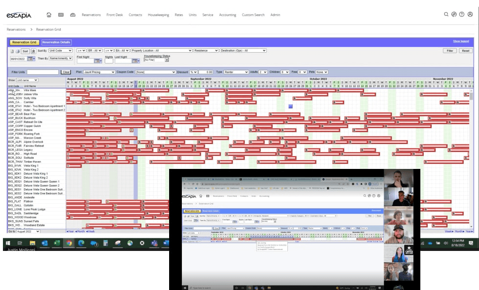
Demo of existing product from a few power users
Interviewed stakeholders to account for full set of use cases
Workshop with revenue management leaders to identify product needs and priority
Surveyed all users to make sure we didn’t miss any key insights
Key Findings
Despite a cluttered UI and serious functionality gaps, users were generally happy with their current tool. It was crucial we preserved what was working well while improving upon pain points.
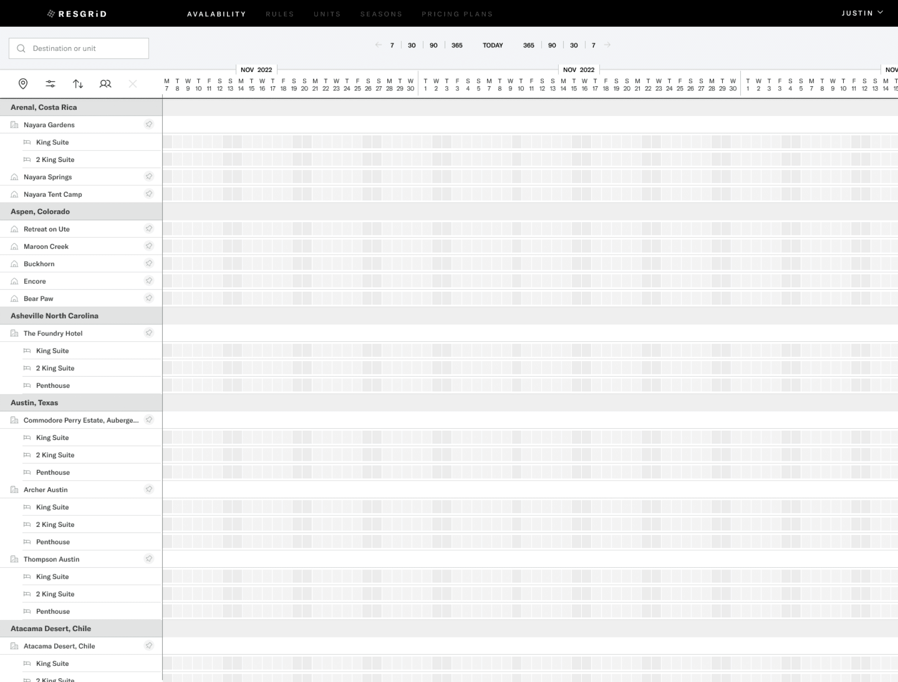
High-density data views mattered — users relied on days and units to monitor destination health and overall business performance
Performance was critical — speed and reliability consistently ranked as high priorities
Data accuracy issues broke trust — incorrect data in Escapia made parts of the system unusable
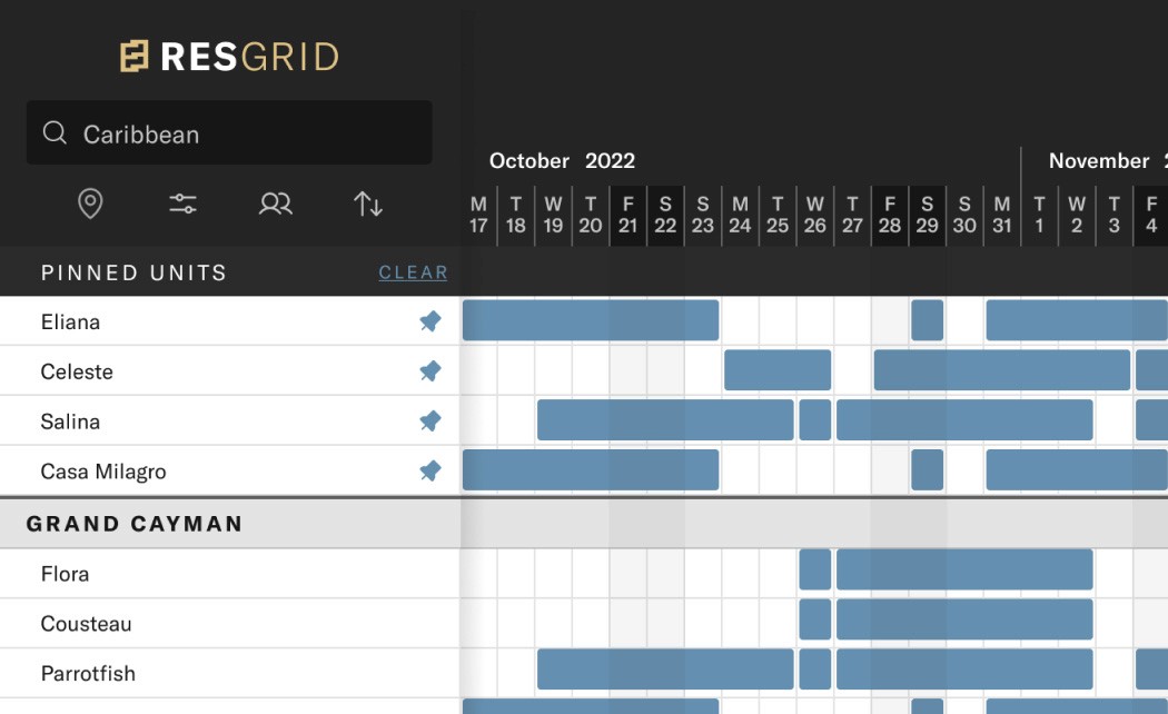
Search was limiting — teams needed to search by destination, not just unit name
Approach
I partnered closely with product managers and engineers to establish a flexible project plan that kept design ahead of development while still respecting the UX process. We adopted a weekly design sprint cadence, ending each week with structured end-user reviews. We also met weekly with key power users to systematically review wireframes and functionality. Each session incorporated feedback from the previous week while introducing new areas of focus, allowing us to iterate quickly and continuously validate direction.

UI EXPLORATION
I started with a broad approach and over a series of reviews narrowed down to a final solution. In this instance, every pixel had a huge impact on spacing and legibility.
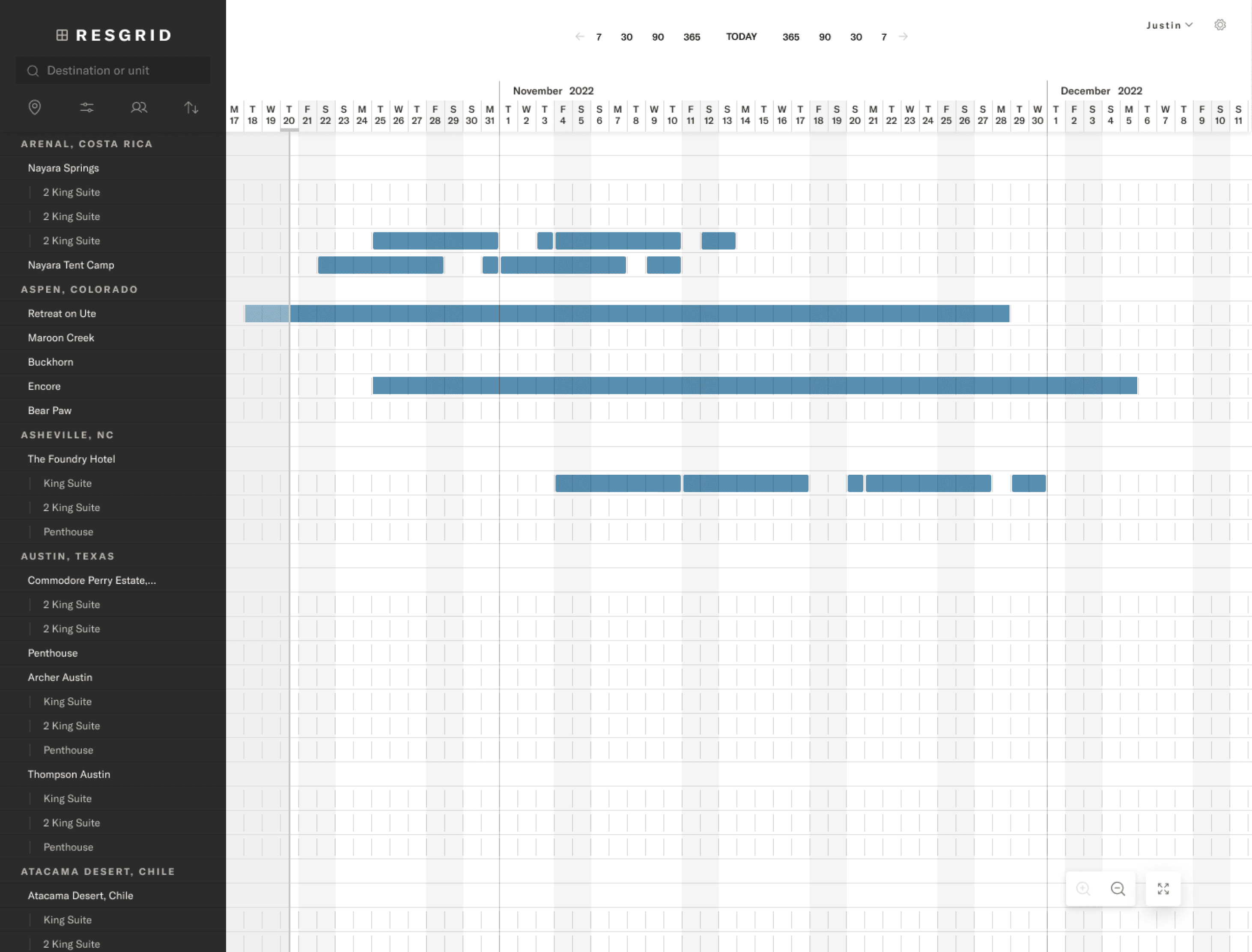

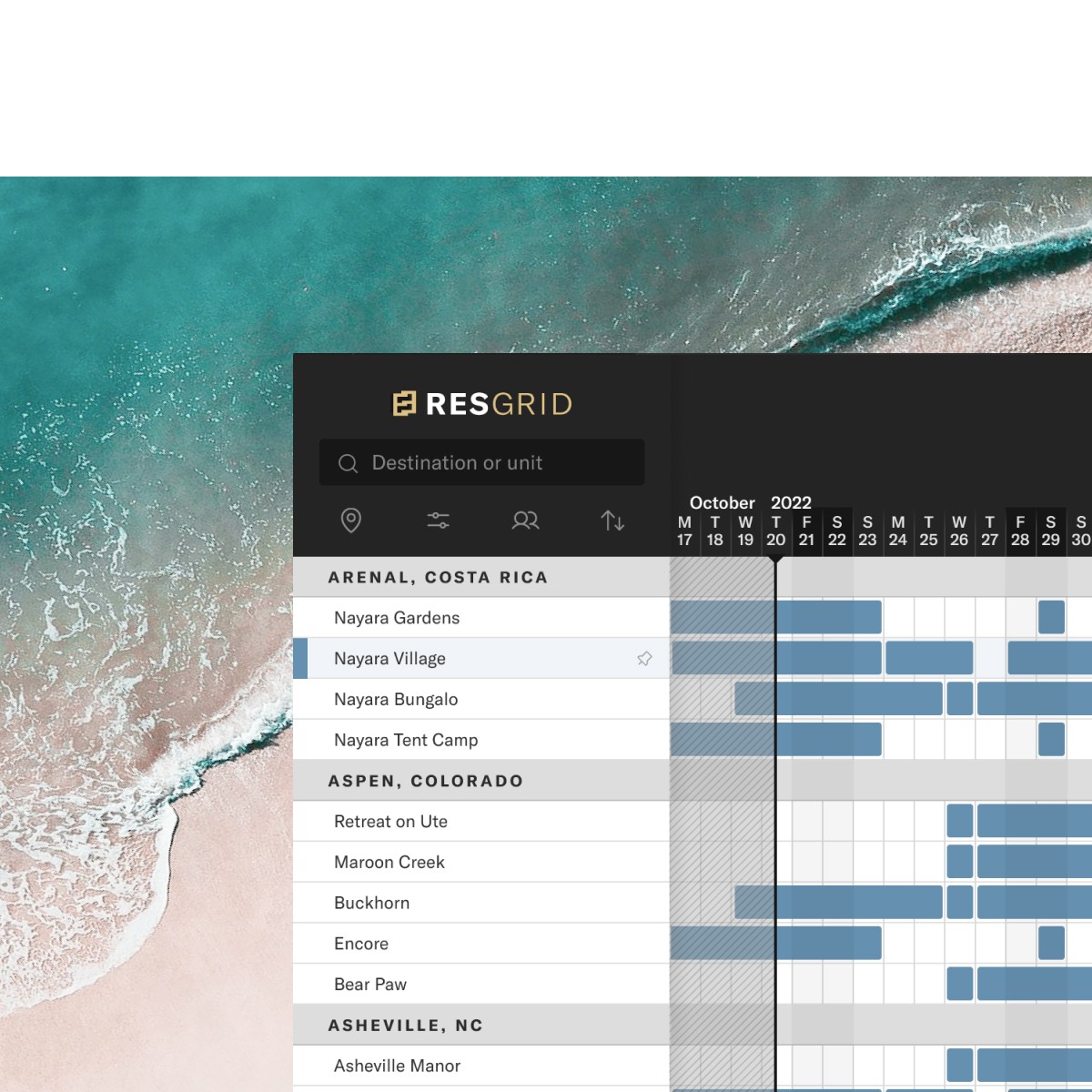
FINAL SOLUTION (MVP)
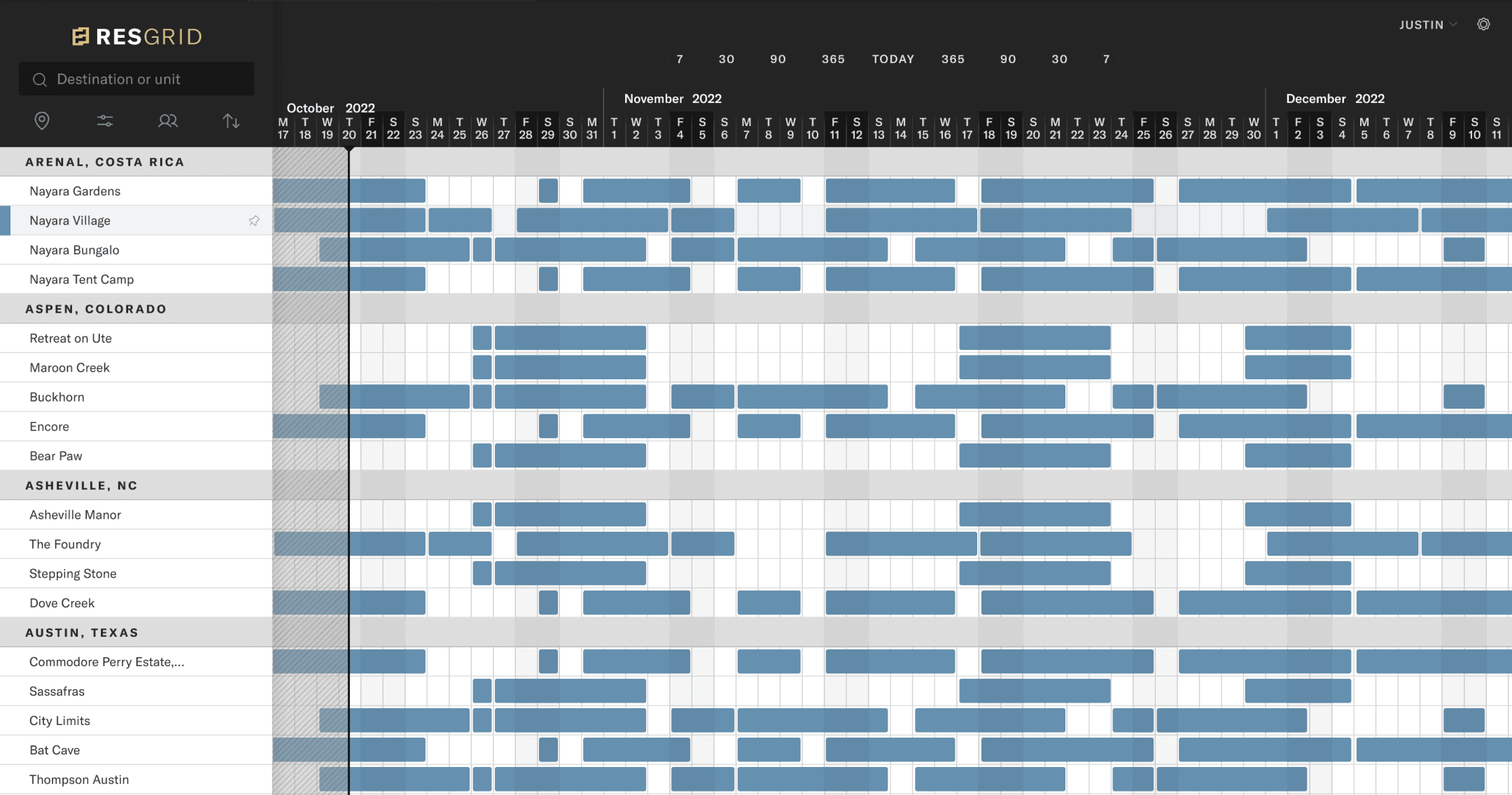
Problem – Often, users needed to compare prices from properties across the grid creating a disconnect.
Solution – Pinning allowed users to compare properties from all over the grid.

Problem – The idea of filters did exist in previous products. Unfortunately, the data was mapped incorrectly and never worked. Additionally, the UI was difficult to follow.
Solution – We leveraged existing consumer facing UI and technology to quickly find properties in a familiar way.
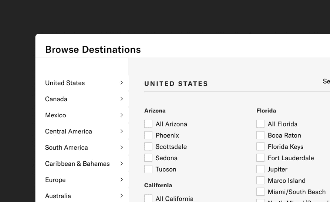
Problem – While most of the users are power users, a subset of users from other departments are less familiar with Inspirato properties. Discoverability was lacking and users couldn't go beyond specific searches.
Solution – We added the ability to browse as a more discoverable experience for those less familiar with our destinations.
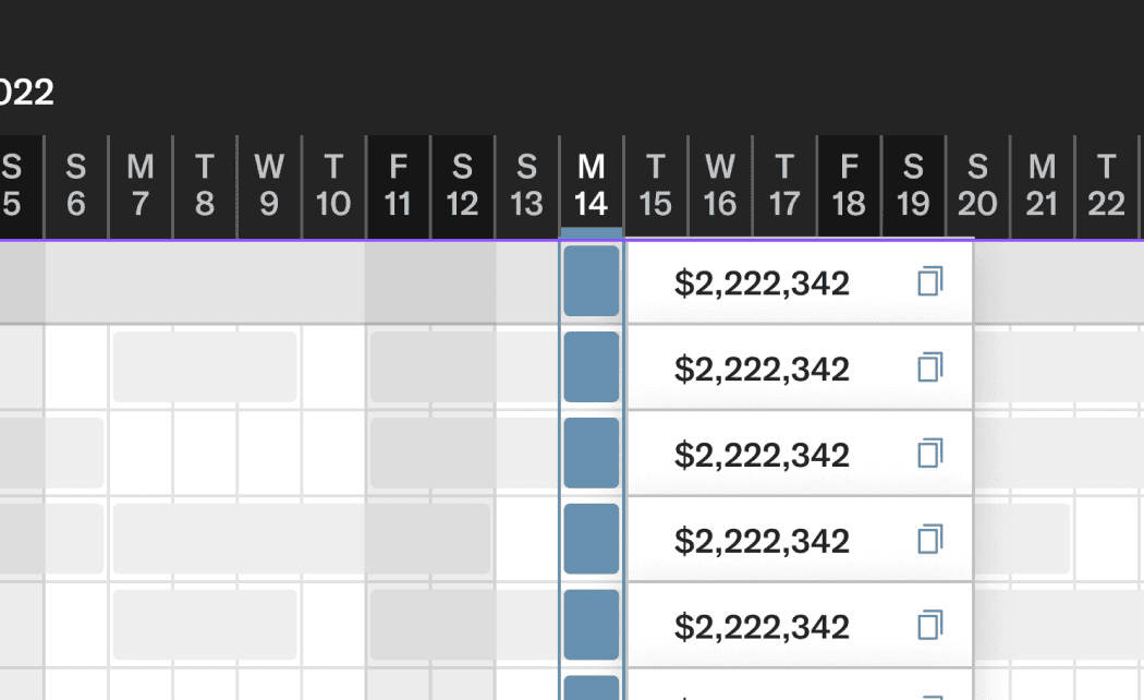
Problem – Users relied on manually writing down pricing to share with other parts of the business. This was tedious and had potenial for error.
Solution – We added the ability to quickly copy pricing details to our users clipboard. Since we had other data at hand we were also able to bring in more context with dates and unit details.
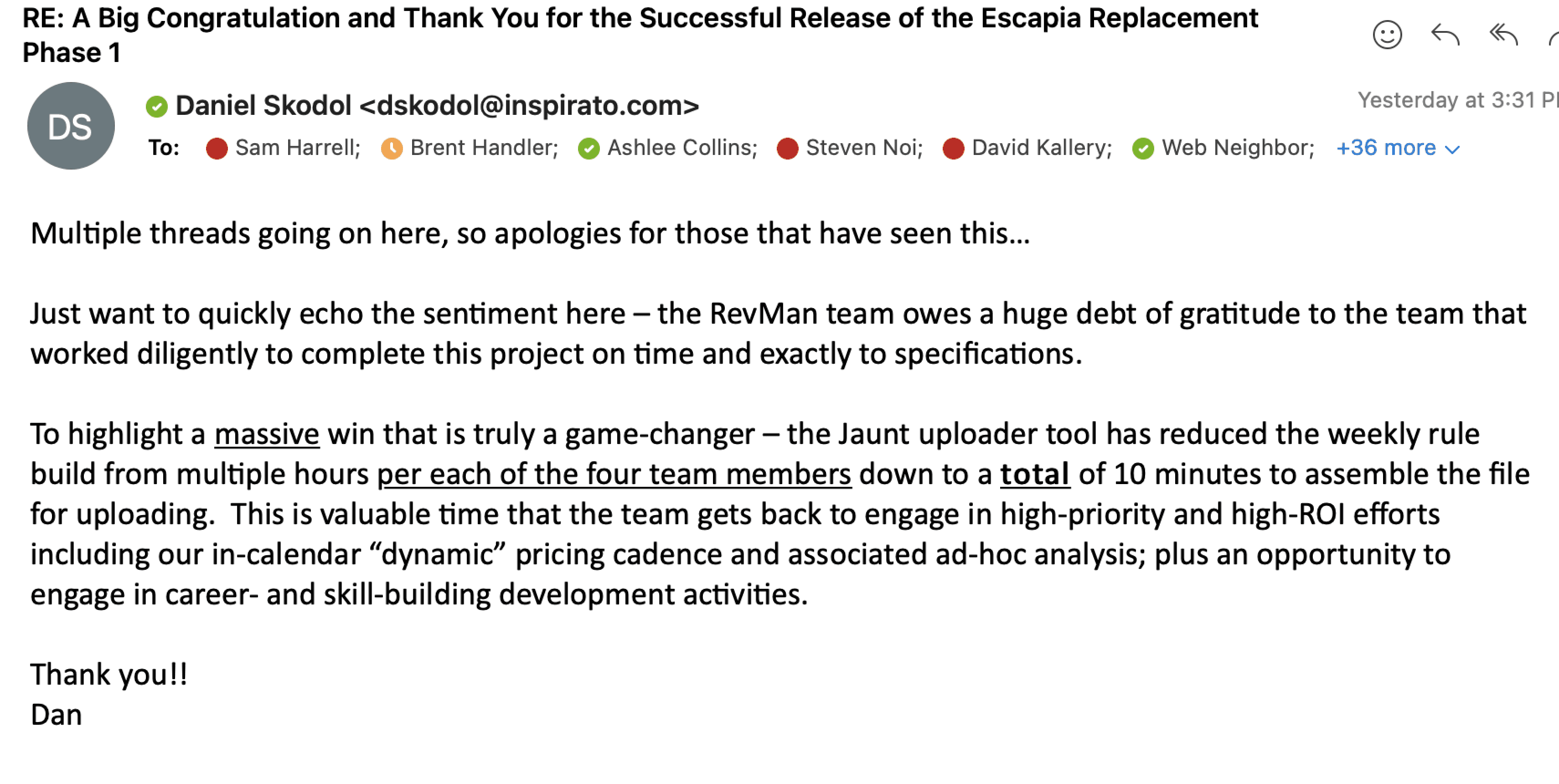
Outcome
By all accounts, ResGrid was a big success, and given its importance, it had to be. As an internal product, we had direct access to both our users and the leadership team, which let us move quickly, test assumptions, and stay grounded in real needs. That proximity paid off. Below is a small sample of the feedback we received.
98
Decrease in a repetitive weekly work
Estimated to save 8 hours per week per employee
88
User Satisfaction Rating
This was a 15-point jump from the previous products score