

Discovery

Concept 1
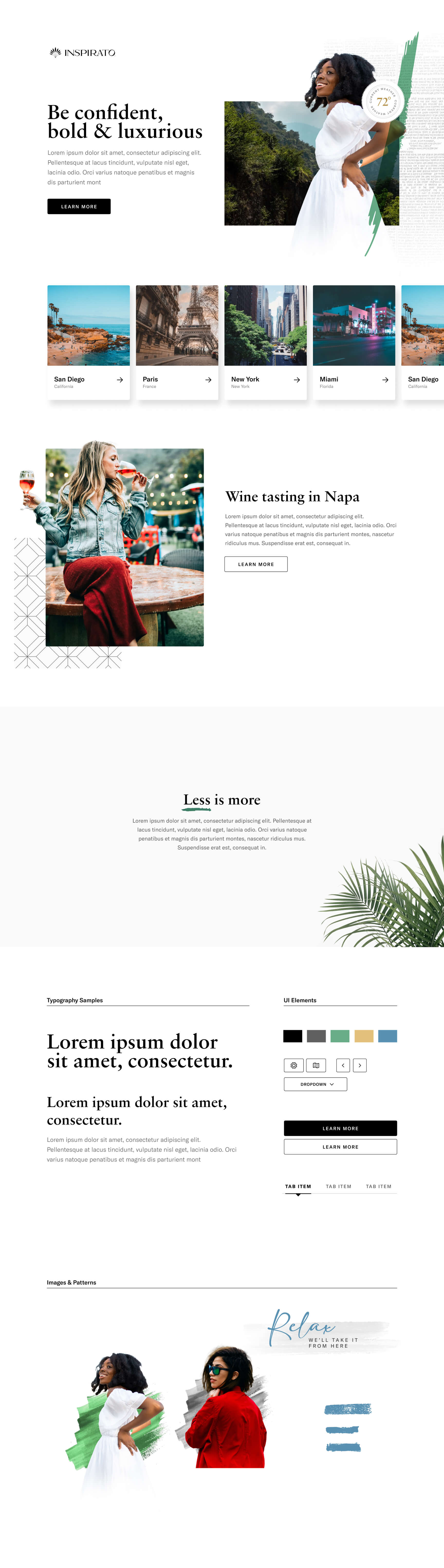
Concept 1 of 3: Light & Artful
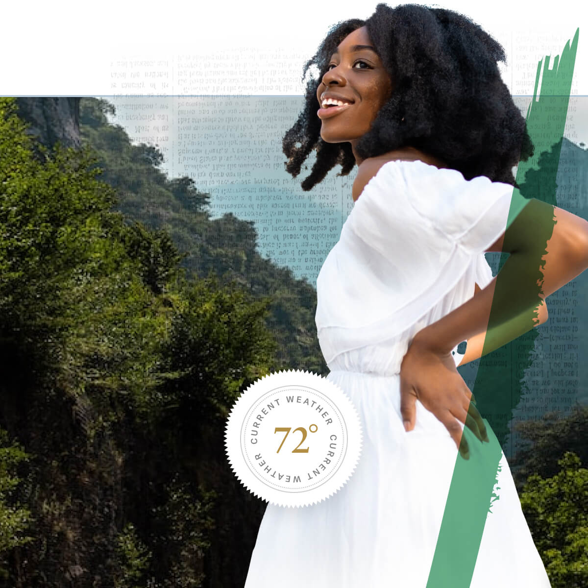
The existing product relied on photography, but it felt generic and sterile. This direction introduced brushstroke patterns to add color and texture to an otherwise black-and-white UI, giving the brand something distinctly ownable. Gold, green, and blue appear strategically through organic patterns, rather than being scattered everywhere. Breaking the image plane was deliberate, pushing past the “template” feeling that had been consistent feedback. When color shows up, it lands with intention.
Concept 2
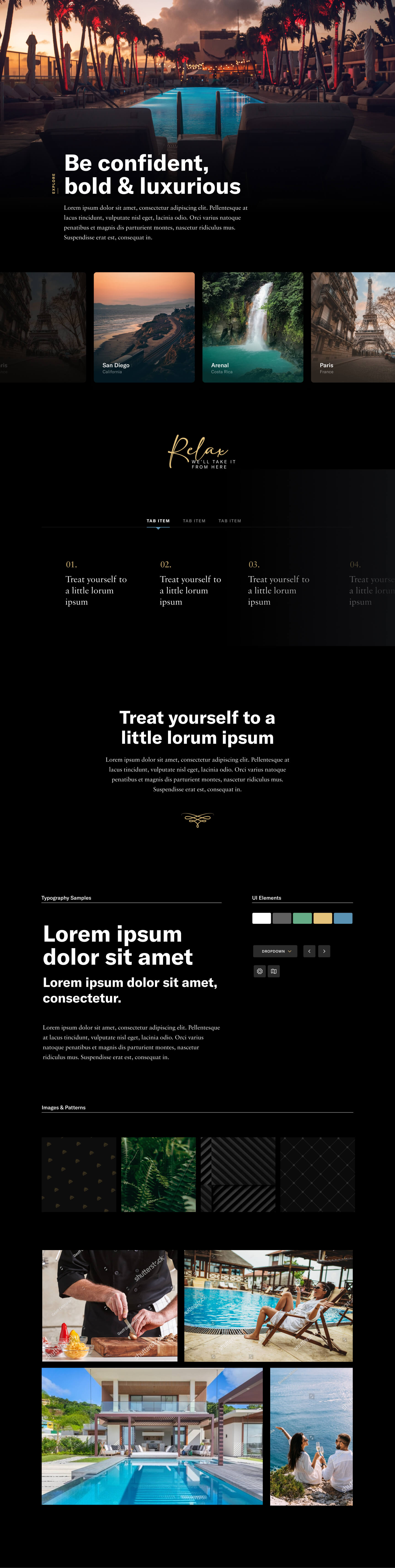
Concept 2 of 3:
Dark & Sophisticated
This direction leaned into mood and exclusivity. A dark background became the canvas, with gold as a hero accent that commands attention. Vibrant photography pops against the darkness, creating visual drama. Subtle black-on-black patterns add texture without noise, giving the interface personality and depth. The typography flipped too: sans serif headlines instead of serif, signaling that we could remix the existing elements in entirely new ways. The overall effect is modern and cinematic, almost like stepping into an exclusive experience.
Concept 3
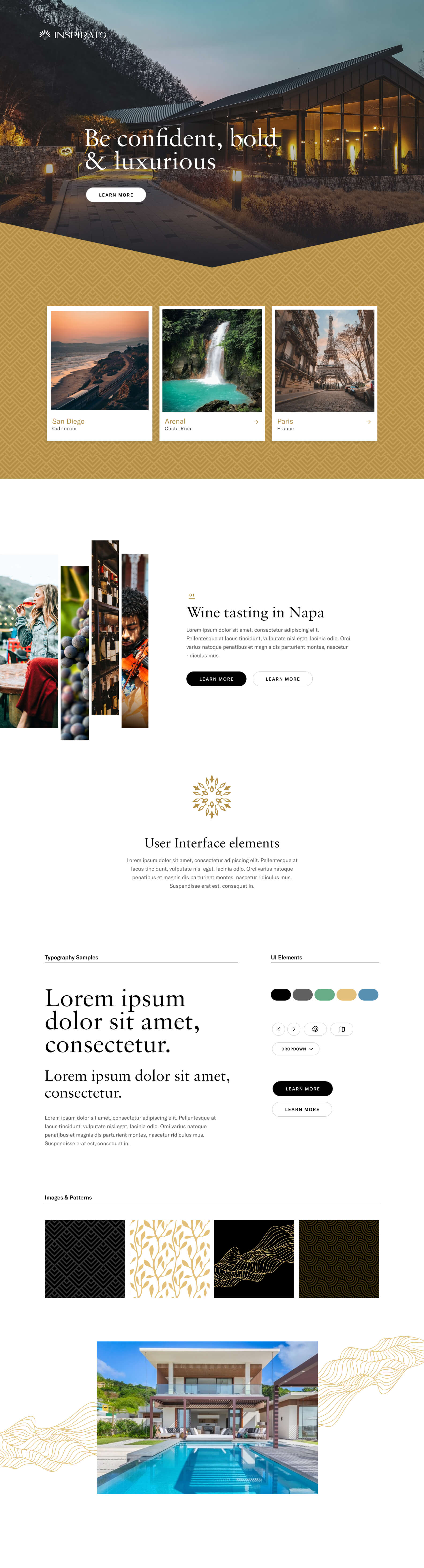
Concept 3 of 3:
Minimal & Editorial
Restraint is a strategic choice. Gold blocks and tightly cropped photo fragments hint at the vibe of a location without revealing the full scene, letting the viewer’s imagination fill in the rest. The arrow shape, borrowed from marketing work, appears both subtly and boldly to create visual continuity. When space is limited, a sliver of vibrant imagery can still tell the story. Large serif headlines breathe on clean backgrounds. This direction favors intentionality over noise, letting every element earn its place.