CASE STUDY
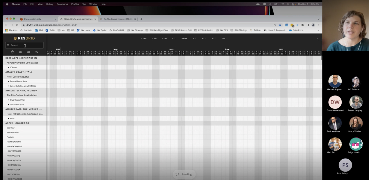
ResGrid
Challenge
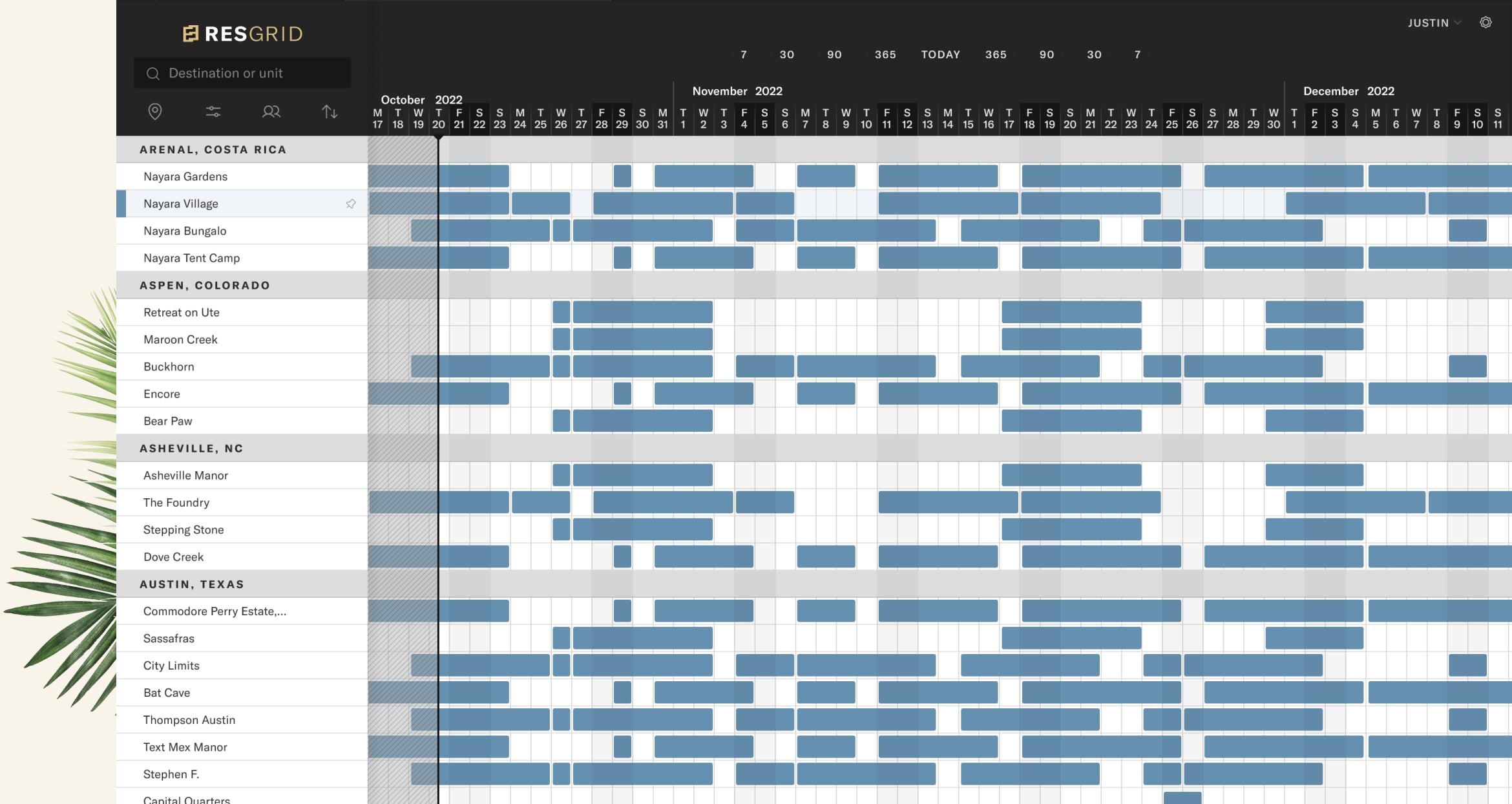
Replace and improve upon a mature product that happens to be essential to the business.
Reservation and pricing are extremely complex due to many variables such as availability and market conditions. Historically, Inspirato had used a collection of third-party software resources to solve these needs. In 2022 we learned our primary software for revenue management was sunsetting their legacy code that Inspirato relied on. It was decided to build this functionality in house rather that continue to rely on external sources. The real challenge was that our team needed to create a robust and mature tool from scratch in less than 6 months. This became priority #1 for our business.

MY ROLE:
Lead Designer
Discovery
Our team quickly moved to understand the unique problems and goals of each stakeholder group. Activities included the following.
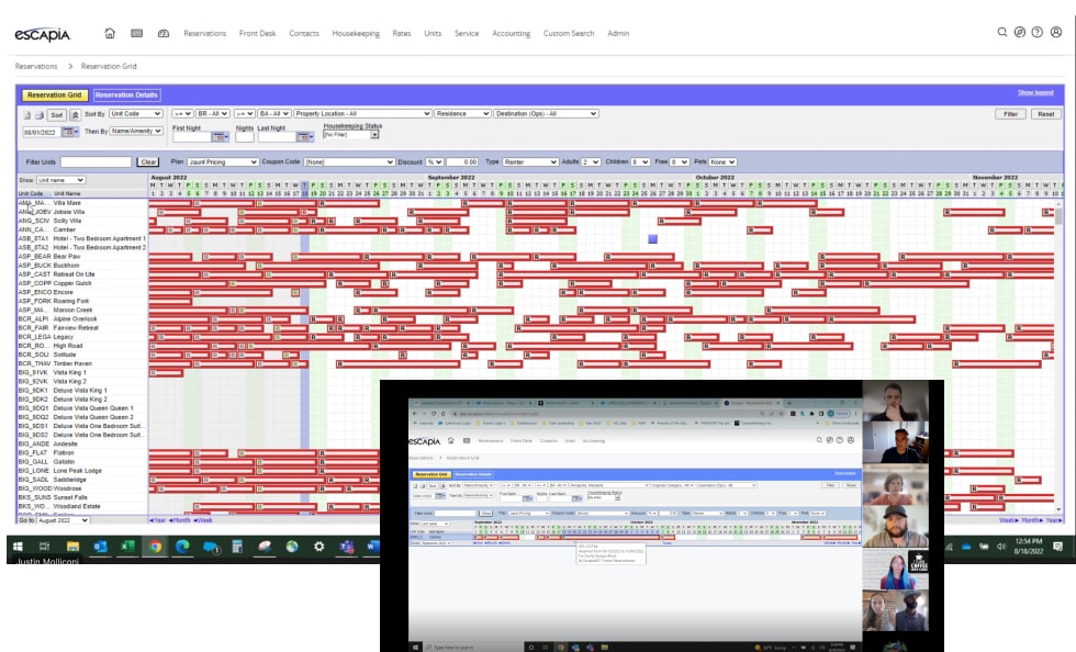
- Demo of existing product from a few power users.
- Interview secondary stakeholders to account for full set of use cases.
- Workshop with revenue management leaders to identify product needs and priority.
- Survey sent to all users to make sure we didn’t miss any key insights.
Findings Overview
Despite a cluttered UI and serious functionality gaps, users were generally happy with their current tool. It was crucial we preserved what was working well while improving upon pain points.
Keep
- Viewing lots of data (days & units) was important. This is how they monitored the health of destinations and the overall business.
- System performance was rated among users as a high priority.
Improve
- Our data wasn’t always correct in Escapia which made some of the functionality unusable.
- Teams wanted the ability to search by destinations rather than just unit names.
Approach
Weekly User Feedback
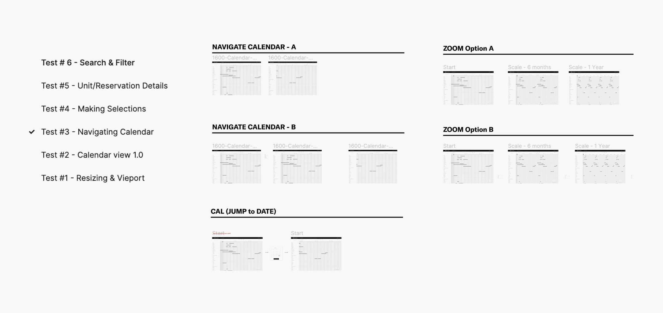
We met weekly with our key power users and systematically went through all the wireframes functionality. Each week we took feedback from previous session as well as new areas of focus.
Visual Design EXPLORATION
I started with a broad approach and over a series of reviews narrowed down to a final solution.

Final Solution (MVP)
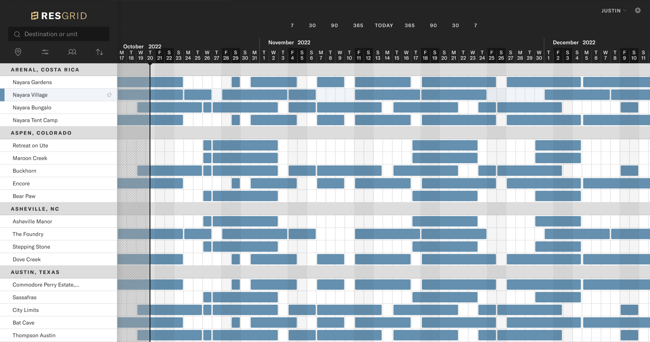
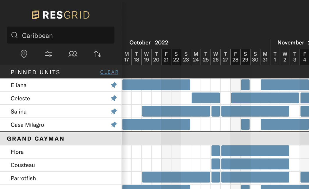
Problem – Often, users needed to compare prices from properties across the grid creating a disconnect.
Solution – Pinning allowed users to compare properties from all over the grid.
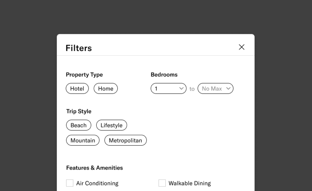
Problem – The idea of filters did exist in previous products. Unfortunately, the data was mapped incorrectly and never worked. Additionally, the UI was difficult to follow.
Solution – We leveraged existing consumer facing UI and technology to quickly find properties in a familiar way.
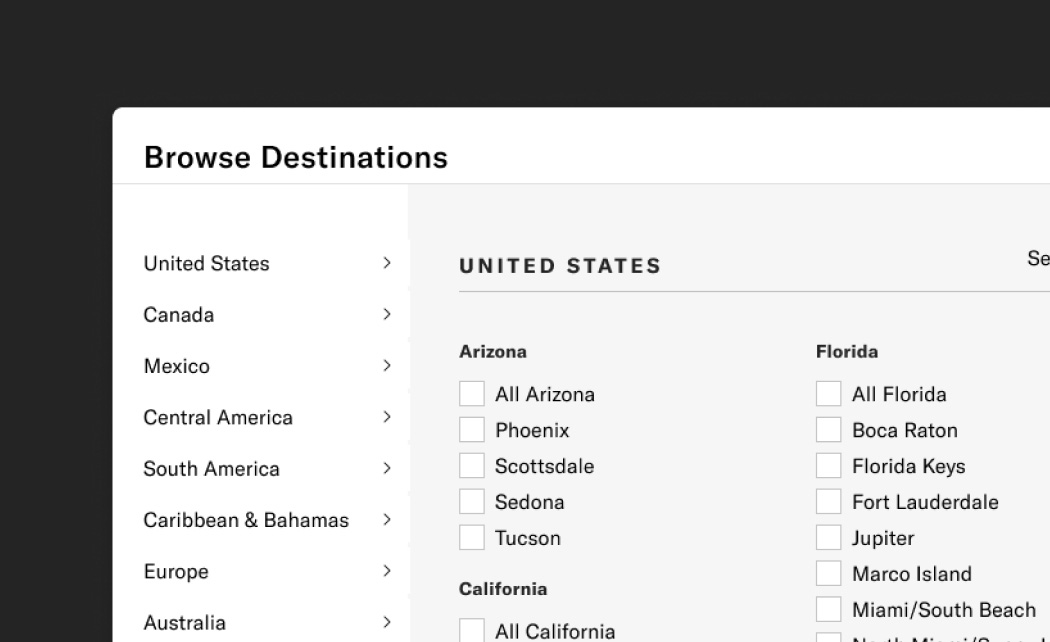
Problem – While most of the users are power users, a subset of users from other departments are less familiar with Inspirato properties. Discoverability was key for this group to go beyond search.
Solution – We added the ability to browse as a more discoverable experience for thoise less familiar with our destinations.
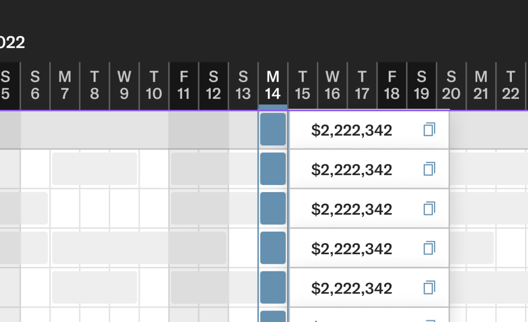
Problem – Users relied on manually writing down pricing to share with other parts of the business. This was tedious and had potenial for error.
Solution – We added the ability to quickly copy pricing details to our users clipboard. Since we had other data at hand we were also able to bring in more context with dates and unit details.
Usability Testing
Designs are never done. After we the MVP was developed and sent through QA, we used that as an opportunity to continue testing with the broader user group. We used a combination of demos followed by surveys to make sure we covered our requirements, and we used the feedback to help prioritize features for V2.
Case Studies
Work Samples

LET'S CONNECT
I’m always interested in meeting kind, talented people who are passionate about what they do. Notice how I put kind in front of talented? It’s kind of a big deal to me. 😉